Hi Guys, In this article, we are going to learn about Custom Dialog Box Component in React Native. Developers sometimes need to show an alert box to display the success or error message. A React Native has its own alert message but this will display the default operating system alert box and it’s very simple.
Check this article which I wrote before for React Native simple Alert dialog but if you want to display nice & awesome dialog in React native then either you have to use any third-party dependency or you have to create a custom component but it takes some time. so In this article, we will create a Nice custom dialog box component in React Native. so let’s start with an example


Contents:
- Create new project
- Create a new CustomAlert.js as a custom dialog component
- Import CustomAlert.js in Dashboard screen
- Pass props to CustomAlert.js
- Create two buttons on Dashboard to display an alert message
1. Create a new project
react-native init ProjectName
I am using my old project which I had created before. Install the following dependency to use icons.
npm install react-native-vector-icons
2. Create CustomAlert.js
Create a custom component in your component directory and paste the following source code into it.
import React, {useState} from 'react';

import {Modal, Text, View, TouchableOpacity} from 'react-native';
import MaterialIcons from 'react-native-vector-icons/MaterialIcons';
import Ionicons from 'react-native-vector-icons/Ionicons';

export default function CustomAlert({
  displayMode,
  displayMsg,
  visibility,
  dismissAlert,
}) {
  return (
    <View>
      <Modal
        visible={visibility}
        animationType={'fade'}
        transparent={true}
        animationType="slide">
        <View
          style={{
            flex: 1,
            backgroundColor: 'rgba(52, 52, 52, 0.8)',
            alignItems: 'center',
            justifyContent: 'center',
          }}>
          <View
            style={{
              alignItems: 'center',
              backgroundColor: 'white',
              height: 200,
              width: '90%',
              borderWidth: 1,
              borderColor: '#fff',
              borderRadius: 7,
              elevation: 10,
            }}>
            <View style={{alignItems: 'center', margin: 10}}>
              {displayMode == 'success' ? (
                <>
                  <Ionicons
                    name="checkmark-done-circle"
                    color={'green'}
                    size={80}
                  />
                </>
              ) : (
                <>
                  <MaterialIcons name="cancel" color={'red'} size={80} />
                </>
              )}
              <Text style={{fontSize: 18, marginTop: 5}}>{displayMsg}</Text>
            </View>

            <TouchableOpacity
              activeOpacity={0.9}
              onPress={() => dismissAlert(false)}
              style={{
                width: '95%',
                borderRadius: 0,
                alignItems: 'center',
                justifyContent: 'center',
                position: 'absolute',
                backgroundColor: 'blue',
                borderColor: '#ddd',
                borderBottomWidth: 0,
                borderRadius: 5,
                bottom: 0,
                marginBottom: 10,
              }}>
              <Text style={{color: 'white', margin: 15}}>OK</Text>
            </TouchableOpacity>
          </View>
        </View>
      </Modal>
    </View>
  );
}
3. Import CustomAlert.js in Dashboard
Import your custom component in your main screen inside the return method. I am using react native hooks in the functional component.
import React, {useState} from 'react';

import {StyleSheet, Text, View, TouchableOpacity, Modal} from 'react-native';
import CustomAlert from './CustomAlert';

export default function Dashboard({navigation}) {
  const [showDonationSuccessPopup, setShowDonationSuccessPopup] = useState(
    false,
  );
  const [showDonationErrPopup, setShowDonationErrPopup] = useState(
    false,
  );


  return (
    <View style={{alignItems: 'center'}}>
      <Text style={{fontSize: 25, margin: 20, textAlign: 'center'}}>
        React native custom alert
      </Text>

      <CustomAlert
        displayMode={'success'}
        displayMsg={'Order placed successfull'}
        visibility={showDonationSuccessPopup}
        dismissAlert={setShowDonationSuccessPopup}
      />
      <CustomAlert
        displayMode={'failed'}
        displayMsg={'Failed, Please try again'}
        visibility={showDonationErrPopup}
        dismissAlert={setShowDonationErrPopup}
      />
      <TouchableOpacity
        onPress={() => setShowDonationSuccessPopup(true)}
        style={{backgroundColor: 'blue', borderRadius: 5}}>
        <Text style={{color: 'white', margin: 10}}>Show success alert</Text>
      </TouchableOpacity>

      <TouchableOpacity
        onPress={() => setShowDonationErrPopup(true)}
        style={{backgroundColor: 'blue', borderRadius: 5, marginTop:10}}>
        <Text style={{color: 'white', margin: 10}}>   Show error alert   </Text>
      </TouchableOpacity>
    </View>
  );
}
4. CustomAlert props
There are four main props that need to pass to CustomAlert component
- DisplayMode: You can display success or error alerts.
- DisplayMsg: You can pass the String message to display on the Alert box.
- Visibility: You can set a Boolean value which only use to display the Alert box.
- DismissAlert: This triggers from Alert box OK button and returns a false value and set Visibility
   <CustomAlert
        displayMode={'success'}
        displayMsg={'Order placed successfull'}
        visibility={showDonationSuccessPopup}
        dismissAlert={setShowDonationSuccessPopup}
      />
      <CustomAlert
        displayMode={'failed'}
        displayMsg={'Failed, Please try again'}
        visibility={showDonationErrPopup}
        dismissAlert={setShowDonationErrPopup}
      />
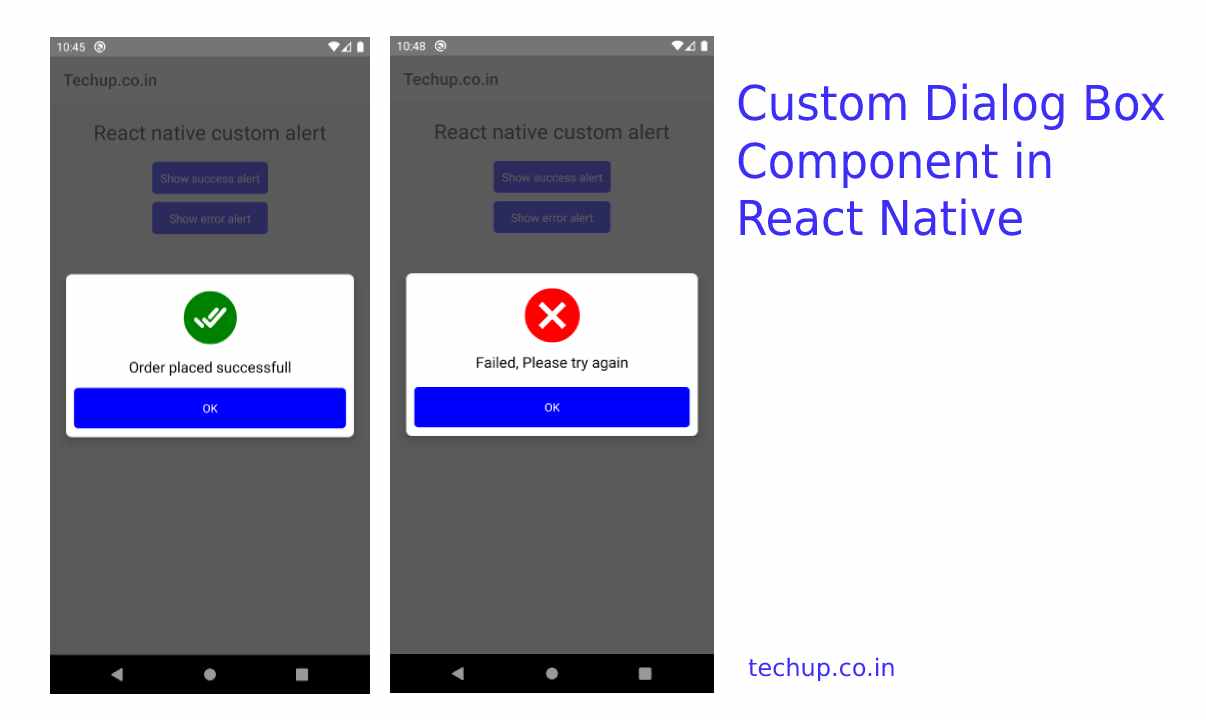
5. Output
Thank you 🙂 , Hope you like this article